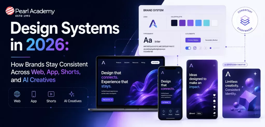
Design systems enable organizations to have a uniform look and feel across all of their designs, from websites and mobile applications to social media posts and AI-generated content. As organizations develop content for more digital platforms than ever before, maintaining consistency has become more difficult. A design system simplifies this by providing each team with a consistent set of principles to follow. A design system ensures that every customer experiences the same brand identity, whether someone is designing a website, generating YouTube Shorts, developing a mobile app, or employing AI to generate ad creatives.
Become future-ready with our Communication Design Programs
Know More
Design systems are a set of standards that define the look and feel of a product and help brands offer a consistent experience across different platforms such as a website, mobile application, YouTube Shorts ad, or an Instagram infographic. Figma defines design systems as reusable building blocks and standards that help maintain consistent product experiences.
Earlier, brands used to design logos, color palettes, typography, and buttons, to ensure brand identity. However, in 2026, design systems are transforming into brand operating systems that help teams keep a brand consistent across every digital surface, including websites, mobile apps, social media videos, short-form content, AI-generated ads, emailers, landing pages, and even chatbot or AI creative outputs. Today’s brand design systems include motion style, tone of voice, prompt rules, video templates, interaction patterns, design tokens, accessibility, and AI governance.
Gone are the days of traditional product designs, in which brands created identities for offline marketing channels or product websites. In 2026, brands are designing digital experiences for a variety of channels, including web pages, mobile applications, Shorts, Reels, AI-generated banners, performance ads, influencer edits, landing sites, and conversational AI interfaces. As a result, keeping a consistent tone is critical for businesses to remain relevant in a competitive market. According to Adobe's 2026 Creative Trends Forecast, AI-assisted design tools are quickening content creation, increasing the importance of brand ownership.
The following are some of the key reasons why design systems matter in 2026:
- The Foundation for Agentic AI: Design systems give AI builders the rules they need to generate consistent, on-brand products quickly.
- Autonomous Governance & Quality Assurance: Smart AI assistants automatically scan code and designs to catch and fix visual mistakes early.
- Unprecedented Development Speed: Pre-made design pieces cut building time in half so teams can skip minor details and launch faster.
- Brand Consistency at Scale: Using a unified digital blueprint keeps a company's look and feel identical across all apps and screens.
Consistency in product design doesn’t necessarily mean designing a product the same way for all channels; rather, it has more to do with creating a product experience that is familiar, reliable, and easy to understand. For example, a luxury fashion retail brand may have different web pages on their website. However, uniform typography, filter behavior, cart icon, CTA language, navigation pattern, and visual hierarchy make users feel connected with the brand. The following are some of the key reasons why consistency is a key feature of brand and product design:
1. Builds User Trust: A cohesive design across different platforms helps improve brand credibility and user trust.
2. Improves Usability: When a user understands the product thoroughly, its features, and how it works, they are easily able to use the product, reducing cognitive load and increasing conversion rates.
3. Improves Learnability: Consistency allows users to transfer skills from one part of a product to another. This allows users to apply their learnings across different features and subproducts.
Design tokens are small building blocks of design systems. These tokens can be defined as named variables that store raw visual design decisions, for example, colors, typography, spacing, or animation speeds. Designers use these tokens to standardize design systems instead of hardcoded values to ensure consistency across departments. For example, instead of hard-coding #2563EB for the shade of blue color everywhere, designers can define a token once as color.brand.primary, and then use it in buttons, links, cards, and apps.
Role of Design Tokens in Ensuring Brand Consistency
Design tokens play an essential role for brands to craft product experiences that are consistent across all channels. The role of design tokens can be understood by the following table:
| Role of Design Tokens | How They Ensure Brand Consistency | Example |
| Standardize Brand Colors | Define a single source of truth for primary, secondary, and accent colors, ensuring every interface uses the approved brand palette. | The token color.brand.primary is used across websites, mobile apps, and marketing landing pages instead of manually entering hex codes. |
| Maintain Consistent Typography | Ensure uniform font families, sizes, weights, and line heights across digital products. | Tokens like font.size.heading.lg and font.weight.bold keep headings visually consistent across all screens. |
| Create Uniform Spacing and Layouts | Standardize margins, padding, and grid spacing to maintain a cohesive visual rhythm. | Using space.4 (16px) for card padding ensures all UI components follow the same spacing rules. |
| Preserve Visual Identity Across Components | Apply consistent border radii, shadows, and elevation styles to reusable UI elements. | Buttons, cards, and modals all reference radius.md and shadow.card for a unified appearance. |
| Enable Scalable Theme Management | Support light mode, dark mode, and branded themes without changing component code. | A semantic token such as color.surface.primary automatically switches values based on the active theme. |
| Support Multi-Brand Design Systems | Allow organizations with multiple brands to share components while maintaining unique brand identities. | A parent company can use one button component while swapping brand-specific color and typography tokens for each subsidiary. |
| Improve Cross-Platform Consistency | Ensure the same design decisions are implemented across web, iOS, Android, and desktop applications. | The token color.text.primary generates platform-specific values while maintaining the same visual appearance. |
| Simplify Brand Updates | Centralize design changes so brand refreshes can be implemented by updating token values rather than editing every component. | Changing the primary brand color in one token automatically updates buttons, links, icons, and banners across all products. |
| Strengthen Accessibility Compliance | Standardize accessible color contrasts, font sizes, and spacing across interfaces. | Updating a text color token to meet WCAG contrast requirements improves accessibility everywhere the token is used. |
| Improve Collaboration Between Design and Development | Provide a shared language that aligns designers and developers around approved design decisions. | Designers reference space.6 in Figma while developers use the same token in code, reducing inconsistencies during implementation. |
As digital marketing continues to evolve, brands increasingly use short-form videos such as YouTube Shorts, Instagram Reels, and AI-generated creatives. Modern design systems allow creative teams to produce high-quality content while maintaining brand consistency by utilizing reusable components and standardized materials.
Design systems support Shorts and AI creatives with the following:
1. Reusable brand components: Design systems include already approved logos, icons, graphics, templates, and user interface elements that can be easily incorporated into social media posts, reels, stories, and AI-generated creatives.
2. Use design tokens for visual consistency: Design tokens standardize colors, font, space, motion, and visual styles, ensuring that AI-generated content and short-form videos seem consistent.
3. Template based content creation: Using pre-made templates for social posts, advertising, presentations, and video thumbnails, creative teams can quickly create many content versions.
4. AI Assisted creative generation: Modern design systems work with AI technologies to create layouts, graphics, backdrops, and copy based on predefined brand requirements.
5. Cross platform scalability: Standardized assets and responsive components allow the same creative to be easily converted for platforms like Instagram Reels and YouTube Shorts.

Student Guidance Center: Our Counselors are Just a Click Away.
Design systems matter in today’s digital world, because they help designers create better products faster without starting from scratch every time. Think of a design system as a shared toolkit that includes approved colors, fonts, buttons, icons, layouts, and design rules. As AI becomes a bigger part of design, design systems are becoming even more important. They ensure that AI-generated designs, websites, apps, and marketing creatives all follow the same brand identity and quality standards. They also make it easier for designers, developers, and marketers to collaborate because everyone works from the same set of guidelines.
For future designers, learning how to work with design systems allows them to gain valuable skills that improve efficiency, support creativity at scale, and prepare them to build consistent digital experiences across websites, mobile apps, and emerging AI-powered platforms.
Reference: