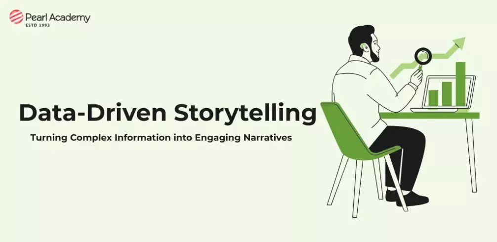
Think of the last time your head started spinning while staring at a cluttered dashboard or a dense spreadsheet. You had the data but no clarity. Now think of a single visual paired with a short story that made the same information click instantly.
That’s the power of data-driven storytelling—it transforms data from confusion into clarity.
Today, we’re surrounded by numbers. Dashboards refresh in real time, reports flood inboxes, and every team claims to be “data-driven.” Yet, most decisions still hinge on human instincts rather than data insights—because interpreting data isn’t easy. Data-driven storytelling bridges that gap by turning raw analysis into meaningful narratives people can understand, connect with, and act on. (SAP, 2025)
Become future-ready with our Communication Design Programs
Know More
What Is Data-Driven Storytelling?
Simply put, data-driven storytelling is the art of combining data, visuals, and narrative to explain a situation clearly and help people make informed decisions. But it’s not just about creating colourful charts—it’s about asking the right questions:
- What is the single insight that matters here?
- Who needs to understand it?
- What story will make it meaningful to them?
As researchers put it, it’s the translation of complex data into understandable insights that drive action, not just awareness. (Kirvan, Gillis & Laskowski, 2024)
In communication design, professors often remind students: “Your bar chart is not the story—it’s a character in the story.”
A strong data story mirrors any good narrative—it has:
- Setting: The context or problem (e.g., “customer churn has risen over three quarters”).
- Characters: The metrics or segments (new users, loyal customers, high-value regions).
- Conflict: The tension the data exposes (rising complaints, falling repeat purchases).
- Resolution: The recommended action (improve onboarding, redesign features, shift budgets).
When data is seen as a journey—from problem to insight to action—it stops being noise and starts being evidence.
If you want your data stories to resonate, here are some tried and tested principles (Knaflic, 2015):
- Know your audience – A marketing head and a product engineer see data differently. Filter out what doesn’t matter.
- Lead with the message – Write your key takeaway first (“Our most valuable customers drop off after month three”) and then build visuals to support it.
- Declutter visuals – Simplicity wins. Remove excess colours, gridlines, and labels.
- Use comparisons, not standalone figures – Stories live in contrasts: this year vs last, test vs control, north vs south.
- End with action – Always conclude with “So what?” or “Now what?” Even a small next step matters.
Who Can Leverage Data Storytelling?
Data storytelling isn’t just for analysts. It’s a skill that empowers everyone who communicates insights:
- Business Executives can craft concise narratives around metrics to lead strategy and inspire teams.
- Product Managers can translate usage data and feedback into compelling product narratives.
- Sales & Marketing Teams can showcase ROI, campaign results, and customer trends with clarity.
- Customer Success Teams can demonstrate progress, highlight churn risks, and articulate value effectively.
- Developers & Designers can build dashboards and interfaces that help users intuitively understand data stories.
In essence, anyone translating information into action—within or beyond an organisation—can benefit from the principles of data storytelling. (Source: Explo, 2024)
The Three Pillars of Storytelling and Effective Communication
Every strong story rests on three pillars—structure, meaning, and emotion.
- Structure comes from collected data.
- Meaning emerges when we interpret that structure to identify insights.
- Emotion is created when those insights resonate with the audience, prompting decisions and action.
When data is represented thoughtfully—through infographics, dashboards, or visual reports—it connects intellectually and emotionally. That connection is what drives impact.

Student Guidance Center: Our Counselors are Just a Click Away.
The art of storytelling with data has become essential in the modern workplace. For designers, managers, and strategists alike, a well-crafted data story can:
- Build trust in recommendations
- Align cross-functional teams
- Enable non-experts to make data-informed decisions
So the next time you open a spreadsheet, don’t just ask, “What does the data say?” Ask instead, “What story does this data allow me to tell, and who needs to hear it?”
That’s where complex information begins to transform into insight—and insight into action.
References
