Picture this for a moment.
You wake up, unlock your phone, and the first thing you see is your weather app slowly shifting from a soft sunrise orange into a cool morning blue. Your budgeting app quietly throws a tiny confetti ripple because you cleared a bill. Spotify drops a suggested playlist and the play button gives a small, confident bounce—as if it’s trying to tell you, “Relax, I’ve got you.” None of this is accidental. This is simply what UX feels like today, in 2025 (Composite, 2025).
Become future-ready with our Communication Design Programs
Know More
When we first heard about flat design, most of us genuinely thought we had found the perfect answer. Clean visuals, simple shapes, no fake shadows, no hyper-real buttons pretending to be physical objects. After years of shiny skeuomorphic design, flat felt mature. But the longer we used it, the more we realised something else was happening in the background. Everything started blending together.
Apps became strangely interchangeable—same safe blues, same predictable card layouts, same icon styles. It was efficient, yes, but it rarely stayed with you. That’s when designers started looking at what was missing and pushed beyond the sameness (Kendrick, 2018).
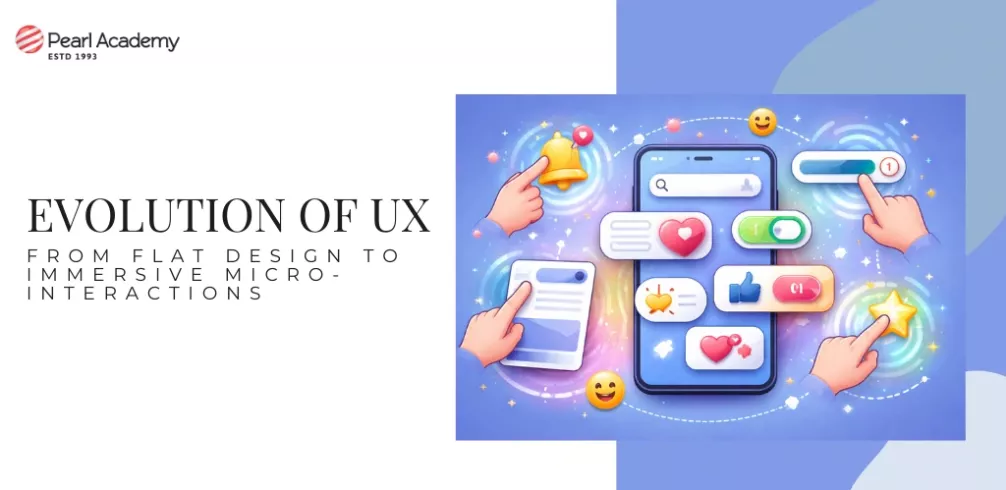
This is where micro-interactions stepped in. These little moments—like a heart popping when you like something, a tick glowing for a second after a form submits, or the soft vibration when you swipe an email—do so much more than decorate the screen. You usually notice them only when they’re not there. A still, silent button on a payment screen instantly makes you uneasy. A tiny “successful” animation can almost make your shoulders drop. Micro-interactions quietly reassure you, guide you and give the product a sense of personality that is subtle but very real (Soegaard, 2024).
For us as designers, this shift changes how we work. It’s no longer enough to line up screens on Figma and call it a day. Now we have to think about what happens between those screens—the rhythm, the timing, the behaviour. What does the interface do before a tap? What does it do after? Does the motion help the user understand something, or is it just noise? In fact, one of the easiest questions you can ask yourself in a critique is: “If this entire screen stayed completely still, what would it feel like?” Follow that with: “Where is the reassurance moment for the user?” Even identifying one action that deserves a meaningful micro-interaction can transform how a flow feels, because now you aren’t just designing visuals—you’re designing behaviour (Kendrick, 2018).
A small exercise can help you see this clearly. Take a simple flow like logging in or booking a ticket. Imagine you’re a tired student using it at midnight on a weak network. Notice where you get anxious, where you hesitate, where something feels unclear. That exact point is where your micro-interaction belongs. Maybe it’s a clear loading state, a little confirmation animation, or even a single reassuring line of text. You don’t need After Effects or fancy tools. Sketch a quick storyboard on paper. The moment you map the movement, the experience becomes visible.

Student Guidance Center: Our Counselors are Just a Click Away.
This shift from flat design to richer micro-interactions isn’t about making interfaces jump around or feel cartoonish. It’s about creating products that behave like they’re actually paying attention—calm when the user is stressed, clear when the user feels lost, and gently playful when there’s room for it. We’re lucky to be learning design at this exact phase because we still inherit the discipline and clarity of flat design, but we also get the freedom to add depth, warmth and personality where it matters most (Composite, 2025). If we start noticing these tiny details now, the products we build in the coming decade won’t just look clean or modern—they will feel like they’re genuinely rooting for the user.
