Every semester, I see dozens of portfolios.
Some are beautifully crafted. The layouts are clean, the colours work well, and every mockup looks ready for Behance. Yet, after going through ten or fifteen of them, something interesting happens—they begin to blur together.
Then, every once in a while, one portfolio makes me slow down.
Not because the visuals are dramatically better, but because the designer lets me into their process. I can almost hear them thinking. I understand why they changed direction halfway through a project, why they rejected an idea they initially loved, or why a tiny design decision ended up solving a surprisingly large problem.
That is the difference between displaying work and telling a story.
Recruiters experience something very similar. They're not looking at one portfolio in isolation. They're comparing yours with dozens, sometimes hundreds, of others. At that point, polished visuals become the baseline. What they're searching for is evidence that you can think like a designer.
This is where a good case study becomes invaluable.
Over the years, I've noticed that the strongest portfolios usually fall into one of five storytelling patterns. None of them is universally "correct." Each simply fits a different kind of project.
Become future-ready with our Communication Design Programs
Know More
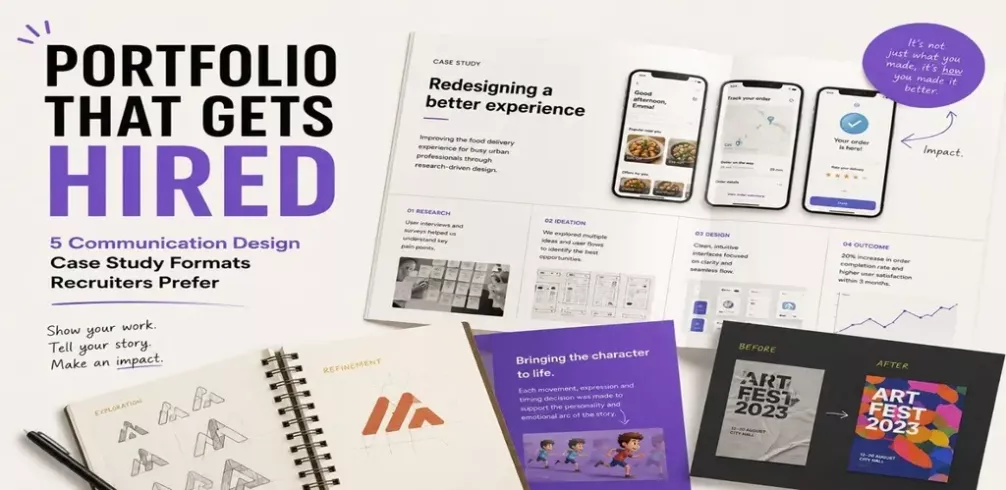
This format feels natural for UX, Product Design, and Service Design because every project begins with someone facing a problem.
Suppose you're redesigning a metro navigation app. If the first thing I see is a collection of attractive interface screens, I can appreciate the aesthetics, but I still don't know what you were trying to improve.
Now imagine beginning with a simple observation:
"Commuters travelling for the first time often missed interchange stations because route information disappeared once the journey began."
Suddenly, every screen that follows has context.
Research findings, journey maps, wireframes, prototypes and final designs all become chapters in the same story. Instead of asking whether the interface looks good, I'm naturally asking whether it solved the problem.
That's a far more interesting conversation.
Creative work rarely happens in a straight line.
A branding project might begin with thirty rough sketches before arriving at a logo. An illustrator may explore half a dozen visual styles before settling on one. An animator might completely redesign a character after the first animation test.
Those discarded ideas aren't mistakes. They're evidence.
Students often hide them because they worry they'll look unfinished. Ironically, those pages are often the ones I spend the most time looking at. They reveal curiosity, experimentation and the willingness to improve an idea instead of becoming attached to the first version.
Think about watching a chef prepare a complex meal. Watching the final plate appear is satisfying, but seeing the ingredients, the techniques and the decisions along the way makes you appreciate the result much more.
Design works exactly the same way.
One of the simplest ways to explain good design is to show life before and after it.
A cluttered brochure becomes easier to read.
An outdated brand identity becomes memorable.
A confusing interface becomes intuitive.
You don't have to over-explain why your work matters because readers can see the improvement themselves.
This format is particularly effective for redesign projects because humans naturally compare things. We instinctively look for differences. If those differences are meaningful, your work becomes memorable almost immediately.
Even Game Design benefits from this approach. Showing the first version of a level alongside the final iteration can say more about your design ability than a paragraph of explanation. Perhaps players kept getting lost. Perhaps combat felt repetitive. When readers see how those issues were addressed, they understand your thinking without needing every decision spelled out.
Some projects aren't trying to solve practical problems at all. They're trying to create emotions.
Animation, Motion Graphics, Exhibition Design and Game Design often belong in this category.
Imagine you've created a short, animated film about loneliness.
Listing the software, you used or explaining your colour palette isn't enough. Instead, walk readers through the emotional journey you wanted to create. Why does the opening feel quiet? Why does the music disappear halfway through? Why does the final scene use warm colours after spending most of the film in muted tones?
The same applies to games.
A horror game isn't memorable because it contains monsters. It's memorable because of the silence before the monster appears, the uncertainty around the next corner, or the subtle environmental details that slowly make players uncomfortable.
Those decisions deserve to be part of the case study because they're every bit as intentional as choosing a typeface or designing a button.
Many portfolios stop at the final deliverable.
I think that's where the conversation should begin.
What happened once people interacted with your design?
Did usability testing reveal that users completed tasks more quickly? Did a client receive positive feedback after a rebrand? Did students understand information more easily after an infographic redesign?
Even academic projects have outcomes. They may come from peer reviews, classroom testing or prototype evaluations.
Sometimes the biggest takeaway isn't that everything worked perfectly. It's that you discovered something unexpected and redesigned accordingly.
Recruiters appreciate honesty. Real projects evolve, and good designers evolve with them.
Every Project Deserves Its Own Story
Students often ask me if there's a perfect template for case studies.
I don't think there is.
Forcing every project into the same structure is a bit like insisting every film should follow the exact same screenplay. A documentary, a comedy and a mystery all tell stories differently because they're trying to achieve different things.
Your portfolio should work the same way.
A UX project deserves room for research.
A branding project deserves room for exploration.
An animation deserves room for storytelling.
A game deserves room for player experience.
The structure should adapt to the project, not the other way around.

Student Guidance Center: Our Counselors are Just a Click Away.
Imagine sitting across from a recruiter who has never met you.
Your portfolio is doing all the talking.
What would you want it to say?
Would it simply announce that you know how to use design software?
Or would it quietly demonstrate that you're observant, curious, thoughtful and capable of solving real problems?
The strongest portfolios don't feel like exhibitions. They feel like conversations. And conversations are surprisingly difficult to forget.
