Walk into any room and the first thing that hits you is colour. Before you notice the furniture arrangement, the ceiling height, or the texture of the upholstery, colour has already done its job: it has set the mood, signalled a style, and made you feel a certain way. This is exactly why interior design color schemes are one of the most important, and most intimidating, decisions any designer or homeowner faces.
This guide covers everything: how colour palettes work in interior design, the rules and frameworks professionals use, which colour combinations create which effects, what is trending right now, and how to apply all of it to real spaces. No vague inspiration here. Just clear, practical, and actionable guidance.
Become future-ready with our Interiors Programs
Know More
A colour palette is a curated set of colours that work together across a space. Think of it as the colour vocabulary of a room: every hue, tone, and shade chosen tells the same story, even if they are doing different jobs within it.
Interior designers almost never choose colours in isolation. They build palettes, because a colour that looks beautiful on a paint chip can completely change character depending on what sits next to it. Understanding this is the foundational skill behind all interior design color schemes.
The colour wheel, first systematised by Johannes Itten at the Bauhaus school in the early 20th century, remains the starting point for every interior design colour decision. It organises colours into primary (red, yellow, blue), secondary (orange, green, violet), and tertiary shades and shows how colours relate to one another spatially.
From the colour wheel, designers derive relationships: complementary, analogous, triadic, split-complementary, and more. These relationships form the basis of the major colour scheme systems that professionals use every day.
Warm tones (reds, oranges, yellows, warm whites, and earthy neutrals) make spaces feel intimate, energising, and lived-in. Cool tones (blues, greens, greys, and cool whites) make spaces feel calm, spacious, and sophisticated. Knowing which effect you want in a room before you choose a single colour is the smartest first step in designing any colour scheme.
In Indian homes, warm tones tend to read as particularly welcoming, partly because of cultural associations and partly because natural Indian light, especially in the afternoon, can be intense and golden. A room decorated in warm ochres, terracottas, and warm whites can feel both contemporary and distinctly Indian.
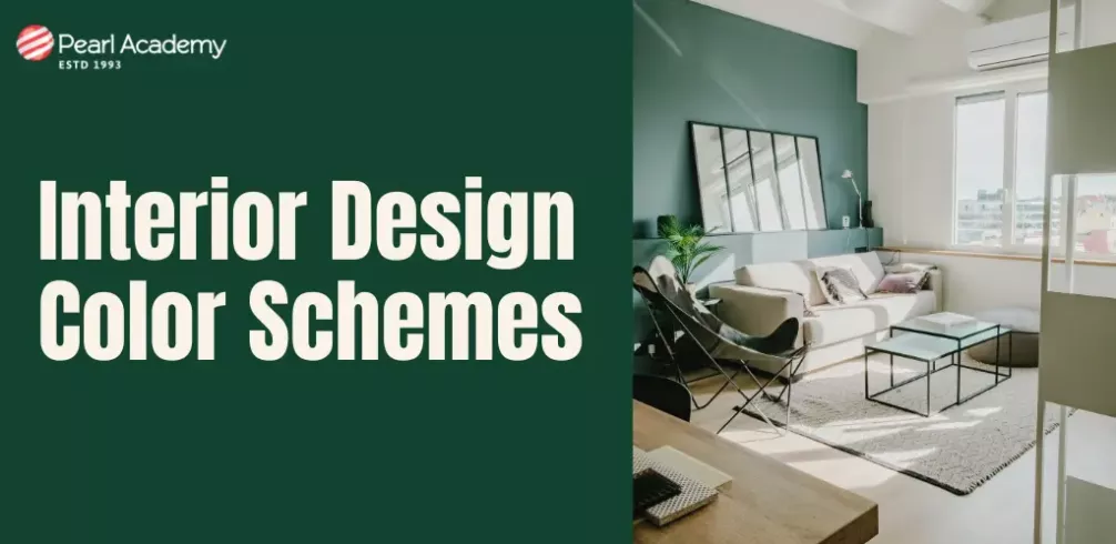
The living room is the most scrutinised room in the home. It is where clients spend the most time, where guests form impressions, and where the biggest design decisions are most visible. Getting the living room interior design color schemes right requires balancing several competing priorities: warmth vs. spaciousness, personality vs. versatility, trend vs. timelessness.
Five Proven Living Room Colour Combinations
- Warm White and Terracotta: A safe, contemporary choice that feels rooted and welcoming. Use warm white on walls, terracotta on a feature wall, soft furnishings, or ceramics. Works brilliantly in both North Indian and South Indian homes.
- Navy Blue and Natural Linen: A classic pairing that reads as sophisticated without being cold. Navy as an accent or feature wall with linen upholstery and natural wood creates a calm, grounded space.
- Sage Green, Warm Wood, and Off-White: One of the most popular living room palettes right now. The sage reads as both modern and natural, the warm wood grounds the space, and off-white keeps it light.
- Deep Teal and Warm Brass: A bolder, more dramatic choice. Works well in urban apartments where a statement living room is the goal. The brass hardware and fittings do the warming work.
- Monochromatic Greige (Grey-Beige): Not boring if done with texture. Layer different finishes within the same greige family: matte walls, linen upholstery, wool rugs, and glossy ceramics. The interest comes from material variation, not colour contrast.
A note on small living rooms in Indian apartments: light, cool-neutral walls will make the space feel bigger. Avoid dark feature walls in rooms below 150 square feet unless you have excellent natural light.
Professional designers do not choose colour combinations randomly or purely by gut feel. They use proven frameworks that are based on colour theory and tested in thousands of real spaces. Here are the most important ones to know.
Complementary Colour Schemes
Complementary colours sit directly opposite each other on the colour wheel: blue and orange, red and green, yellow and violet. Used in equal amounts, they create vibration and visual tension. In interiors, complementary schemes work best when one colour dominates and the other is used as an accent. Think sage green walls with rust-orange cushions and textiles, not a 50/50 split.
Analogous Colour Schemes
Analogous schemes use colours that sit next to each other on the colour wheel: blue, blue-green, and green, for example, or yellow, yellow-orange, and orange. These are the easiest colour combinations to use because there is inherent harmony between the colours. They work especially well in bedrooms and bathrooms where the goal is calm and cohesion.
Triadic Colour Schemes
Triadic schemes use three colours spaced equally around the colour wheel, for example red, yellow, and blue. This creates vibrancy and energy. The key to using triadic palettes successfully in interiors is restraint: choose one dominant colour for walls and large surfaces, one secondary colour for upholstery or rugs, and one accent colour used sparingly in accessories.
Split-Complementary Schemes
A refinement of the complementary approach. Instead of using a colour and its direct opposite, you use a colour and the two colours flanking its complement. For example: orange paired with blue-green and blue-violet. This gives you contrast without the visual tension of a pure complementary scheme, and tends to be easier to work with in residential interiors.
Monochromatic Schemes
One colour, multiple shades, tones, and tints. Monochromatic schemes are not boring if executed well. The interest comes entirely from variation in texture, finish, and tone. An all-white room, for example, can feel extraordinarily rich if you layer matte plaster, polished stone, linen, and glazed ceramic all within the same white palette.
The 3 colour rule is one of the most widely taught and applied principles in interior design. It states that the most cohesive and visually balanced spaces typically use no more than three distinct colours: one dominant, one secondary, and one accent colour.
- Dominant colour (60%): This is the primary colour of the room, usually applied to the largest surface areas, including walls, flooring, and large upholstered pieces. It sets the tone and mood of the space.
- Secondary colour (30%): This colour supports and complements the dominant. It appears on furniture, textiles, curtains, and secondary surfaces. It adds visual interest without competing with the dominant.
- Accent colour (10%): The smallest but often the most memorable element. Used on cushions, artwork, vases, light fittings, and small accessories. This is where you can take a risk and introduce a bolder or contrasting hue.
Example: A living room with warm white walls (60%), sage green upholstery and curtains (30%), and terracotta accessories and artwork (10%). Every element has a role. Nothing competes. The space feels curated without feeling studied.
The 3 colour rule does not mean you can never use more than three colours. It means that beyond three, you need to be much more intentional to maintain visual coherence. Neutral shades of white, cream, and natural wood generally do not count as 'colours' in this framework.
There is no single best colour in interior design. That is the honest answer. The best colour depends on the function of the space, the amount of natural light, the occupants, the climate, the building's architectural style, and the room's material palette. However, some colours consistently perform well across a wide range of contexts.
The Most Reliable Performers
| Colour | Where it works | Why it works |
| Warm White (e.g., Indian White, Jute) | Any room, any size | Reflects light, adapts to any accent colour, never dates |
| Sage Green | Living rooms, bedrooms, kitchens | Calming, contemporary, works with warm wood and stone |
| Warm Greige (Grey-Beige) | Open-plan living areas | Neutral with warmth, works in variable Indian light |
| Terracotta | Accent walls, dining rooms, studies | Adds warmth and cultural resonance, pairs beautifully with blues and greens |
| Deep Navy or Slate Blue | Bedrooms, feature walls, bathrooms | Sophisticated, grounding, works with warm brass and natural wood |
| Soft Terracotta Pink (e.g., Blush) | Bedrooms, children's rooms, nurseries | Warm, inviting, gender-neutral in its more muted forms |
| Charcoal or Warm Black | Kitchens, studies, accent walls | Bold and grounding, makes other colours pop, works with almost any palette |
For Indian homes in particular, warm whites with golden undertones (rather than cool, blue-toned whites) tend to perform best. Indian natural light in the afternoon is warm and golden, and a cool white wall can look grey and dull in the hours before sunset. Warm whites stay consistent and welcoming throughout the day.
Some colour combinations have proven themselves so consistently that they have become classics of interior design. Here are combinations that you can rely on across different rooms and styles.
Timeless Pairings
- White and natural wood: The most universally appealing combination in interior design. Works in every room, every style, every budget.
- Navy and warm brass: A contemporary classic. The deep blue grounds the space; the brass adds warmth and glamour.
- Soft green and warm cream: Calm, contemporary, and quietly luxurious. Works especially well in bedrooms and reading rooms.
- Terracotta and indigo: A combination with deep roots in Indian textile and craft traditions. Rich, warm, and full of character.
- Charcoal and pale blush: A sophisticated pairing for bedrooms and living rooms. The charcoal adds gravitas; the blush softens it.
- Warm grey and mustard yellow: An energetic pairing for kitchens, home offices, and casual living rooms.
- Teal and copper: Bold and contemporary. Best used in spaces that can handle visual drama, like a statement dining room.
Combinations to Approach Carefully
- Red and green (equal proportions): Can read as festive rather than designed. Use as a very small accent pairing, not a dominant scheme.
- Too many warm tones without a cool break: A space that is all warm red-orange-yellow can feel overpowering. Introduce one cool or neutral element to balance it.
- Clashing saturated complementary pairs: Fully saturated orange and blue, or red and green, in large proportions create visual discomfort. Mute or tone down at least one of the pair.
Most interior design colour theory references seven core colour schemes. These are the foundational frameworks that every design student and professional should know before they start developing their own colour instincts.
- Monochromatic: One colour in varying shades, tones, and tints. Creates cohesion and elegance. Interest comes from texture and material variation.
- Analogous: Two to four colours adjacent on the colour wheel. Creates harmony and calm. Ideal for spaces where relaxation is the goal.
- Complementary: Two colours opposite each other on the wheel. Creates contrast and energy. Best managed with a dominant/accent ratio.
- Split-Complementary: A colour plus the two colours flanking its complement. Offers contrast with less tension than a pure complementary scheme.
- Triadic: Three colours equally spaced on the wheel. Creates vibrancy. Requires careful management to avoid visual chaos.
- Tetradic (Double Complementary): Four colours forming two complementary pairs. Very rich and complex. Requires a strong dominant to maintain coherence.
- Square: Four colours spaced equally around the wheel. Similar to tetradic but with different proportions. Rarely used in full; more useful as a reference for accent selection.
In practice, most successful residential interiors use either monochromatic, analogous, or complementary schemes. Triadic and beyond are more common in commercial, hospitality, and retail design where visual impact is a primary goal.
The 3-5-7 rule is a guideline for grouping decorative objects in odd numbers to create more natural and visually pleasing arrangements. It is most often applied to shelving, mantelpieces, side tables, and any surface display in a room.
How the Rule Works:
- Groups of 3: The smallest effective grouping. Three objects of varying height, scale, or texture create visual rhythm without clutter.
- Groups of 5: A medium grouping with more opportunity for layering. Mix heights, shapes, and materials. Odd numbers prevent the symmetry that can feel static or predictable.
- Groups of 7: Larger arrangements, typically used on bookshelves, console tables, or feature walls with multiple framed pieces. Variety in height and spacing is essential.
While the 3-5-7 rule is primarily about object grouping rather than colour schemes specifically, it is deeply connected to how colour is distributed across a room. An odd-numbered grouping of decorative objects gives you natural opportunities to distribute your accent colour (the 10% in the 3 colour rule) across a space without it feeling forced or symmetrical.
In interior design, colour is one of the seven classical elements of design, alongside space, line, form, texture, light, and pattern. Understanding colour not in isolation but in relation to these other elements is what separates a good designer from a great one.
How Colour Interacts with the Other Six Elements
- Space: Dark colours make spaces feel smaller and more intimate. Light colours expand perceived space. This is not just paint on walls but applies to furniture, flooring, and ceiling choices too.
- Line: The colour of lines (skirtings, cornicing, shelf edges, trims) defines architecture and can either soften or sharpen the geometry of a room.
- Form: The colour of an object can make it feel heavier or lighter. A dark sofa feels more anchoring than the same sofa in a pale colour.
- Texture: Colour and texture are inseparable. The same paint colour applied to a matte plaster wall and a glossy lacquered surface will look like two different colours. Texture affects how colour absorbs and reflects light.
- Light: Natural light changes colour throughout the day. A terracotta wall in morning light reads very differently from the same wall in afternoon golden light or evening lamp glow. Always view paint samples at different times of day before committing.
- Pattern: Pattern is built from colour. A traditional block-printed textile or a geometric tile floor brings multiple colours into a space in a structured way. Your palette needs to account for the colours already present in your patterns.
This interconnection between the elements of design is precisely what makes interior design a discipline worth studying formally. Understanding theory in a classroom, practising it in a studio, and developing an eye through real project work is a process that accelerates your ability to make confident, cohesive design decisions.
Colour trends move in cycles of roughly two to five years, shaped by cultural moments, global events, material availability, and the trend forecasts published by organisations like Pantone, WGSN, and national paint manufacturers.
2026 Interior Colour Trends to Know
- Warm Nude and Blush Earths: The move away from grey continues. Warm nudes, dusty pinks, and earthy terracottas are the new neutrals. These tones layer beautifully with natural materials and handcrafted objects.
- Mocha and Mushroom Tones: Deep, warm browns are having a major moment in 2025, both in interior paint colours and in furniture and fabric choices. Mocha brown reads as grounded and luxurious without being dark or heavy.
- Olive and Moss Greens: Where sage green was the story of 2022 and 2023, deeper, more complex olive and moss tones are now taking its place. These greens work especially well with natural stone, brass, and warm wood.
- Warm Black and Off-Black: Not a retreat to cold minimalism, but a refined use of warm charcoal and off-black as base colours paired with warm naturals. Particularly popular in kitchens and studies.
- Dusty Lavender: An unexpected trend that has emerged from the intersection of maximalism and craft aesthetics. Used as an accent or even a feature wall colour, dusty lavender adds something distinctive and memorable.
Indian interior design is increasingly asserting its own colour identity rather than simply following Western trends. Spice-market terracottas, deep indigo blues, mango yellows, and the particular rich warmth of Indian textiles are all being incorporated into contemporary Indian interior design in ways that feel fresh and intentional rather than traditionally referential. This is an exciting space to work in.
Understanding colour theory at the level described in this blog is genuinely useful. Applying it confidently across real projects, managing client expectations around colour, specifying exact paint references and material finishes that achieve the effect you want, and knowing how light will interact with your choices in a real space: all of this comes with practice, mentorship, and structured learning.
Colour is not a skill you master by reading about it. It develops through making, reviewing, and refining, ideally with experienced practitioners who can give you feedback in real time.
Pearl Academy's B.Des in Interior Architectural Design is a four-year undergraduate programme that covers everything from colour and spatial theory to construction technology, lighting design, sustainable materials, and client communication. Students work in design studios, build portfolios through live briefs, and benefit from industry engagement that prepares them for real design practice.
For graduates and working professionals looking to go deeper, the M.Des in Interior Design at Pearl Academy offers a postgraduate route into specialisation, research-led design, and senior design roles.
| Programme | Duration | Who is it for | Career Opportunities |
| B.Des Interior Architectural Design | 4 Years | Students after Class 12 | Interior Designer, Space Planner, Retail Designer, Set Designer |
| M.Des Interior Design | 2 Years | Graduates and working professionals | Senior Designer, Design Researcher, Design Director, Independent Practice |
| Styling for Interiors Certificate Course | 11 months | Applicants must be 17 years old | Interior stylist, Interior decorator, and Visual merchandiser |
Entry-level interior designers in India typically earn between Rs 3 and 5 lakhs per annum. With three to five years of experience, that range extends to Rs 7 to 15 lakhs. (Sources: Glasdoor) Senior designers and those running their own studios can earn significantly more, depending on the type, interior designing skills, and scale of projects they take on.

Student Guidance Center: Our Counselors are Just a Click Away.
Colour is one of the most powerful tools in interior design and one of the most learnable skills. The frameworks covered in this blog: the 3 colour rule, the 60-30-10 ratio, the 7 major colour schemes, and the relationship between colour and the other elements of design, are not abstract theory. They are the practical scaffolding that experienced designers use on every single project.
The most important thing to understand is that colour confidence comes from practice. You will not develop a reliable eye for interior design color schemes by reading about them alone. You develop it by testing combinations, observing how light changes a space, studying rooms that work well (and asking yourself why they work), and getting feedback from people who can see what you cannot yet see in your own work. If you are thinking about interior design as a career, or you are at the beginning of your design education journey and want to build this kind of fluency properly, a structured programme is the most efficient path. The theory gives you a framework; the studio practice gives you the instincts.
